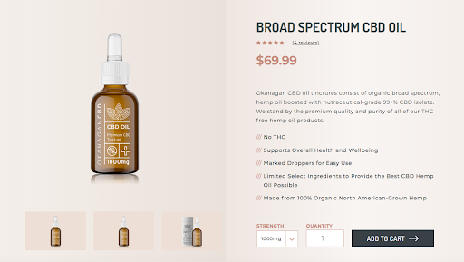
Ultimately, the goal of a well-optimized product page is to increase sales. Sounds simple, but in fact, encouraging visitors to click the ‘add-to-cart button’ requires a number of components to be placed optimally on the page and to work in sync. In general, the page must highlight the product (of course), be informative and enticing with great copywriting and be easy to use with a strategically planned page design. Your unique branding should be obvious and shine through all these components. A person could conceivably land directly on a product page without going through your home page. Associating your spectacular product with your brand from the get-go is the first step in developing customer loyalty.
Let’s unpack the features that make up a great product page.
1. Use Exceptional Product Photos
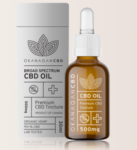
In an actual brick and mortar store, the shopper can touch the product, pick it up, try it on, see how it feels and looks on their unique body. Online shopping provides so much less sensory information. Providing detailed, professional quality photos will help bridge that sensory gap somewhat.
Accordingly, the photos must be of high quality. Don’t skimp on this and upload blurry, little images that will immediately associate the product in the customer’s mind with low quality. It isn’t just aesthetics; customers need to see high quality images to derive information about the product. To make it almost as good as being there:
- Customers will want to be able to zoom in on a product to see details.
- They will want to see the product from multiple angles.
- Link your images to variants of the product (if any)
- Depending on the product they will want to see it in context (show somebody wearing the clothes).
- Depending on the product, they might want to see it in use.
- Include videos if it makes sense for your product.
2. Leverage Low-key Cross-selling
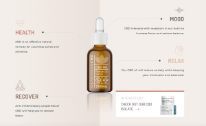
A photo-related feature that will not only enhance your conversion rate but also user experience if it is done correctly, is to offer images of complementary or related products. This could be something in the line of including thumbnails of the accessories shown in the product image of a model wearing a blouse, for example. A potential customer looking at the blouse image might be thinking how nice the bracelet goes with the blouse, and wondering where or how to buy one. A discreet thumbnail with an add-to-cart link is simply being helpful.
The trick here is to be subtle. Don’t annoy potential customers by bombarding them with images that are only distantly related and will distract them from buying the product at hand. Rather, provide truly useful suggestions and do it discreetly and thoughtfully.
3. A Prominent Call to Action (CTA)
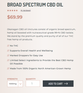
The Call to Action is the most important item on the product page, from a selling point of view; you really want that visitor to click it, and you need to make it easy for them to do so.
The CTA’s message must be crystal clear (Add to Cart, for example ). This is not the place for any sort of clever play on words or ambiguity.
As well, the CTA must be immediately visible, standing out from the rest in some way. Provide enough white space around the CTA so it doesn’t get lost in clutter, and if it fits with your branding, use colour to make it instantly obvious.
4. Great Copywriting
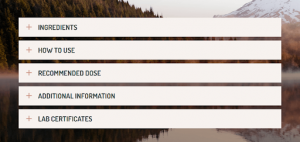
Be Useful – Think Customer-first
Copywriting must above all be useful to your potential customer. To be effective you need to anticipate the questions and concerns your customers will have, and proactively address them. Key to this, is a good knowledge of your target customers: what are their general concerns, how will they use your product and so on. Generally, people require more detailed information before they buy a higher priced item than a lower cost one.
Layout is also important. For detailed information, organize it in short blocks that are easy to scan so your customers can quickly find what they want to know.
Be Engaging
This is especially important for the product descriptions. Always speak in your brand’s voice, and to your specific customers. Never, ever just copy-paste the manufacturer’s description. If possible, add testimonials with story-like details, if not a whole story — although that might be appropriate in some circumstances. People relate to stories. Short narratives about personal experience using a product in real life can activate intangible, emotional associations such as a sense of quality.
5. Trust Signals and Social Proof
Practical Information
Trust signals are all those things that inspire confidence in your potential customer by addressing the practical concerns upfront. These are the concerns that otherwise might stop the potential customer from purchasing — concerns such as shipping costs, how it will ship, when it will arrive, returns et cetera. Details or links to more information should be provided in the above the fold area of the page. This is a great place to promote free shipping also. Providing the option to save to a wishlist is also a great idea to keep those customers who don’t want to buy right away in the loop.
Customer Reviews
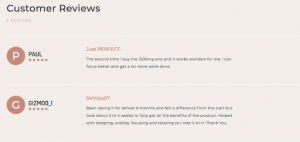
Customer reviews are one of the most important elements you can add to your page to provide social proof. People look to fellow customers for unbiased testimonials about the value of a product. Reviews build trust and go a long way in convincing customers to buy. Stellar, detailed reviews are best, of course, but even a few less-than-stellar reviews aren’t necessarily the end of the world; they can add validity and the sense of impartial honesty.
Key Takeaways
Incorporate these five suggestions and you will be well on your way to increase your ecommerce conversions. The most important point to remember is to step in your customer’s shoes. Be sure to provide an experience that is focused on being helpful with all the information your customers need. Buying should be in an easy, distraction-free process.


