As humans, we’re very visual creatures. It’s an evolutionary imperative. In nature, colors play a big role in survival. Bugs, for example, maybe colored red to signal to predators that they are poisonous. Flowers are brightly colored to better attract bees.
Applying color psychology is a powerful way to boost website conversions. Check out this detailed color psychology infographic to learn what emotions specific colors convey and what will convert best for your brand and industry.
Why is Color so Important for Conversions?
In the human world, colors are just as important, but for different reasons. We’re not necessarily involved in a life-or-death struggle every day.
Color does have an impact on what we do and think, though. We use visuals to help us make judgment calls. Color psychology influences our actions in subtle ways that we may not even be aware of.
Think back to when you were last at your favorite fast-food restaurant—chances are they used bright and cheerful colors. Bright reds and oranges are popular because they’re exciting. They rev us up. This, in combination with high-energy music, is used when designing eateries that want tables to turn over more quickly.
What is Color Psychology?
Color psychology focuses on how human behavior and decision-making is influenced by color. This discipline explores how colors influence both our conscious and subconscious behavior.
Color Psychology in Marketing
Color psychology can be extremely helpful to marketers as well—think of a basic call to action button.
Humans are visual creatures. So visual, in fact, that color plays a much bigger role in influencing what we choose to purchase than we might think. Color can be used to:
· Create more excitement
· Engender trust
· Convey a sense of energy
· Attract attention
Understanding color psychology can help you take your marketing efforts to the next level. HubSpot, for example, increased their CTR by 21% just by changing the color of their call to action button from green to red.
A/B Testing: How Colors Influence Online Buying Decisions
The average person takes around 90 seconds to assess a product. That’s not a lot of time to gather information, so most of that decision is based on visuals. Around 62% to 90% of the assessment is based solely on color.
Do a simple experiment. Create two ads or two landing pages. Make them exactly the same. Now choose one element that you can change the color of. Some ideas are:
· Call to action button
· Background
· Text color
Once you’ve created the two versions, run a split test to see which one performs better. Which color is a better fit with your marketing message?
How to Choose the Right Color to Convert Visitors
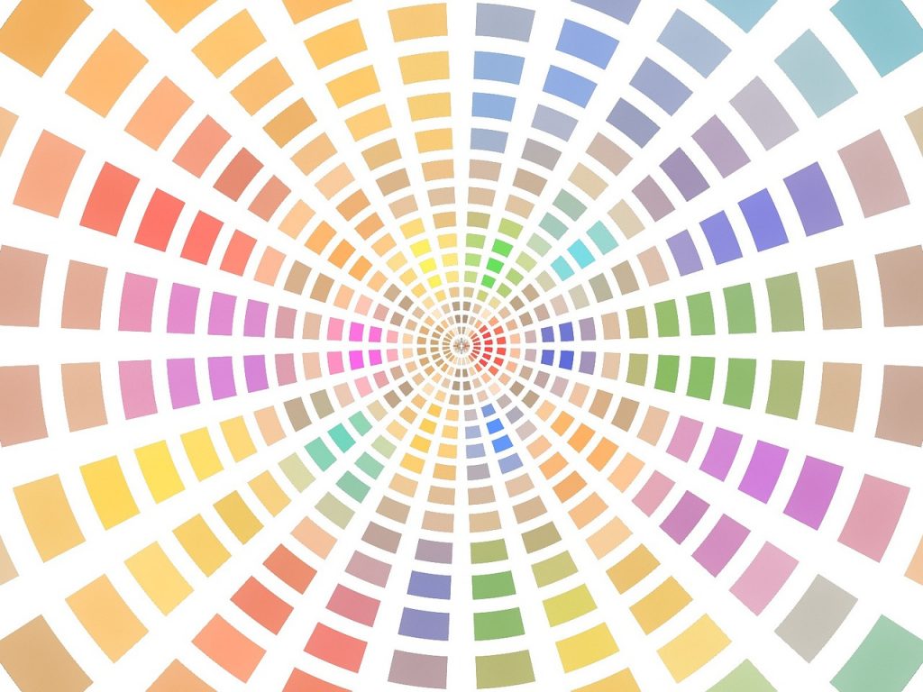
We all have subconscious associations with different colors. Let’s have a look at what our associations with the primary colors are.
Blue
Blue is tranquil and relaxing. It’s a color that’s associated with trust. That’s why a lot of financial institutions choose blue as their primary brand color.
If you want your clients to slow down and take their time, blue is a good choice. Let’s go back to the fast-food example. These restaurants make their money by selling large volumes of low-priced items. The faster the clients move in and out, the more money they stand to make.
If you were running a gourmet restaurant, on the other hand, you’d want to encourage people to relax and slow down. That way they’re bound to spend more on drinks and desserts. Blue would help to create a relaxing and inviting feel for visitors.
Red
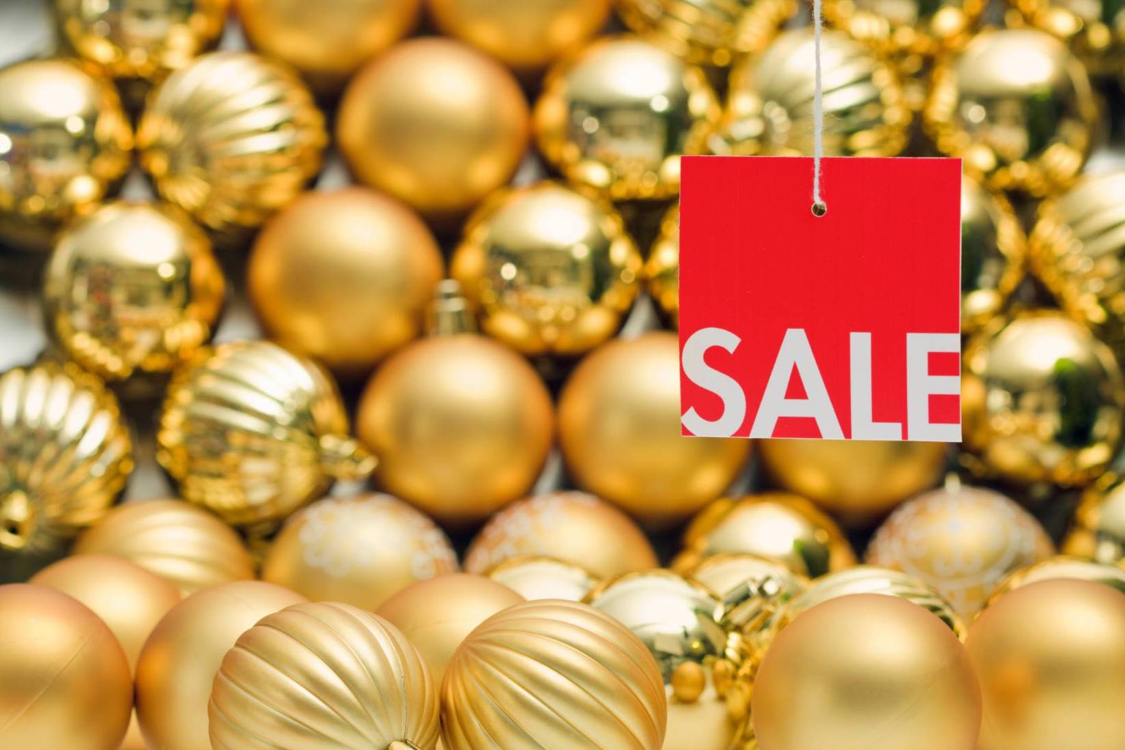
Red, on the other hand, is a color associated with excitement. It helps to create a sense of urgency, which is why you’ll often see “Sale” signs in bold red. Red stands out and gets attention, but it is not a particularly relaxing color.
Yellow
Yellow is another cheerful color. It’s also useful in situations where you want to achieve higher energy since It’s a color that will make you feel more energized and carries positive associations. (Think about sunshine and light.)
If you would like to check on the subliminal messages that the other colors send out, check out the infographic below.
Final Notes on Using Color Psychology to Boost your Conversion Rate
As digital marketers, we need to use every potential tool in our arsenal. Color psychology is a highly effective one, and with some planning, it can be used to great effect. When creating your next campaign, it’s wise to keep these color associations in mind. After all, you don’t want the colors you use to send the wrong message subconsciously.

This is a guest post contributed by Max Chekalov, Co-Founder & Content Developer, Design Advisor.

