Using social networks for promoting your brand online is the new standard, but along with every new opportunity, social media marketing presents us, comes new risks and questions.
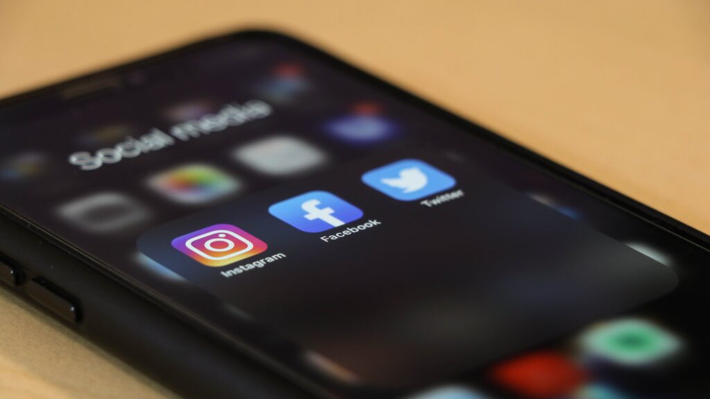
Here are a few tips and considerations for integrating your website design with your social media marketing efforts by adding social media buttons to your site:
Are you linking to outdated or underperforming networks?
Only include social media buttons that direct to pages that are recently updated and regularly nurtured. Having a link to a photo-sharing service where you haven’t posted since 2010 is not doing you or your organization any favors. Same goes for a video channel where you only have a few videos—videos that can be found on blog posts or web pages already.
Posting frequency is THE number one measure of success for any campaign, social media or otherwise. Developing content guidelines and creating editorial calendars helps us to be consistent on all of our chosen channels. There are always a few networks that fall by the wayside, not necessarily because they underperform, but because their function may not suit everyday or every-week use.
Which Channels Are Best To Showcase?
Limit prominent links to the branded pages that you are focusing on in your multi-channel approach. Only use the pages that have fresh content, and use the remaining icons to tell a story about the culture of your organization. Example: here.
Take into consideration that having a Facebook “Like” button on posts and pages significantly slows down your page load time which will affect your SEO. Limit the use of Facebook buttons on pages to when you really need them, like services and products pages.
Where to Share?
Every social media channel serves its own function. However, online communities exist for only one purpose: the voting up or down of content. With social bookmarking sites, the biggest being Reddit and Digg, voting on content adds a layer of verification that turns data into meaningful information.
Every network votes on content in their own way, with shares, likes, views, retweets, favorites, upvotes, repins and stumbles.
Like it or not, these are the networks that we all have our content submitted to. Not every page needs to be shared, and not every post will be shared either, but having some kind of share button is necessary to gain exposure for your content.
The most popular approach is to have a few featured sharing buttons, usually to Twitter, Facebook, Google Plus, and one to Email. Services like sharethis.com and addthis.com are optimal for your social media buttons because they allow global visitors to your website to share on the networks that are relevant to their country. Sharing on Orkut might not be relevant to visitors in North America, but with hundreds of millions of users from countries like India and Brazil, that’s a whole market you might be missing. With ShareThis and AddThis you’re covering all of your sharing options.
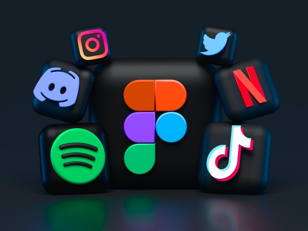
Ask your web developer what options are available for your site’s platform, because many content management systems support sharing features with a plugin, widget or module.
Follow You Where? Why?
Combining social media buttons and calls to action is tricky. Making your icons match the background of your site is a first start, and there are lots of inspiring examples out there. (There’s 55: Here). However, if you change the icons too much you may lose the “familiarity factor” that brands like Facebook already have.
Photo Credit: obeyken
Try different strategies and language with your callouts, commands and prompts. Track your results with each change and compare them. Dustin Curtis tracked the results of variations of “I’m on Twitter” and increased his clicks by 173% by changing his callout to “You should follow me on twitter here” (with ‘here’ being a hyperlink to his account). Read the full article by Dustin here.
Get creative. Stay current. Be awesome.
A general rule to follow is to have one social icon on every fold of a web page. Make it easy for your visitors to find your icons at the top, bottom and sidebar of the page, but be careful to not over do it. For a fantastic example of what not to do, see the Oatmeal’s: How to get more likes on Facebook (NSFW).
There is no need to manipulate your website’s visitors so they add you to their other channels. Your website is the foundation of your online presence and all of your other accounts need to be represented. Your clients will digest your content on whichever network suits them and their values. The best step you can take is make your links visible and ensure they work.
Of course, you should follow us on Twitter here.
Related articles:
9 Tips for Integrating Social Media Buttons on Your Website: Social Media Examiner
Social Media Buttons and Viral Marketing – WDL

