QR codes are deceptively simple. They can be created for free in a matter of seconds and they provide an instant connection between the physical and virtual worlds, but that doesn’t mean you can just slap a code on a wall and call it a campaign. No, like any good digital marketing campaign, QR codes require creativity, nurturing and planning.
What is QR code?
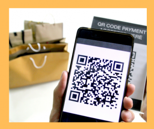
Quick Response Codes, aka QR Codes, are barcodes that hold a lot of information. When used in consumer marketing, QR codes are used to inform consumers about the product the QR code is on. To do this, QR codes are scanned using a QR code scanning app on a smartphone. Then, after the code is scanned, the user is directed to a URL embedded in the QR code.

This time-saving tool enables users to access information about products and services with their smartphone; but, without having to type in an address, or look through a search results page. Essentially, QR codes create a direct link between a product and a consumer.
As you can imagine, when used correctly, QR codes can be a powerful marketing tool. But, if you fall victim to the most common QR code campaign mistakes, your campaign might be doomed to fail.
Read on to find out the most commonly made mistakes in a QR code campaign.
The destination is not relevant
QR codes take some effort by the user to decipher. If the information discovered with a QR scan is not relevant to the item it was found on, precious time has been wasted, and, the user may be unimpressed.
And, unimpressed users don’t easily return. It’s vital to your QR campaign to make a positive first impression.
It’s important that the time taken to scan a QR code is worth the customer’s time. Consider the many steps required by a user to reach the final scan destination:
- Take out phone and find the scan app.
- Scan the code (multiple times if the code isn’t easily accessible)
- Wait for the page to load.
- Finally, reach the QR scan result.
Once the multiple steps to access the QR codes content are completed, the content better be awesome and, of course, mobile-friendly!
For a better way to coax consumers to scan a QR code, let them know exactly what they’re scanning for. Promises of coupons, discounts, freebies, insider info, or anything else that will encourage consumers to carry out the scan from start to finish.
The location is not accessible

There are appropriate places for QR codes, and then there are places that aren’t as effective or appropriate.
Appropriate locations should be in places where people can easily access a QR code. High traffic areas where people tend to congregate and wait are ideal choices. Some examples of appropriate locations for a QR code are:
- Waiting areas: buses, bus stops, airports
- High pedestrian areas
- Labels, business cards, posters, or any other place where people will want to learn more
- Storefronts (to direct customers to online shopping when your physical business is closed)
Locations that should be avoided to feature QR codes are:
- Places with poor or no internet connections: subways, in-flight magazines, library basements.
- On things that move, like vehicle exteriors, bicycles.
- Inside of packaging and other hard to find spots.
- On fast food packaging, where it will be obscured by greasy patches and melted cheese
The QR code isn’t appealing
QR codes that aren’t customized, or made visually remarkable, can be easily overlooked. To make them more appealing, noticeable, and approachable, you can apply graphic design techniques using an online editing tool.
Graphic design to customize your QR code can include: rounding the corners of your QR code, changing the color (it can be anything as long as it’s contrasting enough to scan), or, to add interesting elements to the QR codes frame for a unique look.
As well, if you generate your code with a 30% error correction you can easily replace the redundant boxes of code with your own logo!
The QR code is broken

Before releasing your QR code into the public realm, make sure it works. Test it multiple times, and be sure to test it using different devices and browsers. As well, after you’ve tested it and ensures it works, plan to re-test it regularly.
You’d be surprised at how many companies direct their users to a 404 page or an invalid security certificate. And remember, although your QR code lasts forever, the information attached to it doesn’t have to. It’s easy to change the destination from the back end without changing the QR code itself, so there’s no reason to leave users with expired promotions or out-of-date information.
How is your QR campaign?
Did you identify with any of the QR code mistakes listed above? If so, likely a simple correction is all that’s needed to get your campaign back on track. Try adjusting the content connected to your QR code and make it more relevant, or, find better locations to have your codes featured.
If after making adjustments in your QR code campaign, you’re still not seeing the results you had hoped for, consult with digital marketing experts. Stikky Media are leading marketing professionals that can get your QR code campaign moving in the right direction.
For tips and ideas on how to improve your business presence online, check out our blog!


